Feature importance estimation
by: Kevin Broløs
(Feyn version 3.1.0 or newer)
Many other ML tools have support for calculating SHAP values and Feyn is no different. It's often useful for data scientists to use SHAP as a method for estimating feature importances, or getting an overview of which features contribute where, and when.
The graphs in Feyn are easily translatable to mathematical functions and are as such immediately inspectable. You can also use, for instance, the partial plots or the signal summary to get an idea of how data points move through the graph and how they affect the outcome.
Sometimes, you'd like to know more about what features contribute to a decision, and you might have a handful of decisions you want to get explanations for, and that's where SHAP can come in useful - and especially our flavour, that relates it directly to the samples themselves.
Because the underlying engine here is SHAP, it's important to understand the uncertainties related to this and that it's just an estimate of how the graph acts under different inputs (and it might even explore areas of the data that is not strictly possible).
If you want to learn more about this, we suggest reading more up on what SHAP is and how it works - and which assumptions it makes of your data (for instance, it assumes that your features are independent).
What would you like to know?
Before you use this, it often makes sense to consider what kind of question you're asking. For instance - you might have a bunch of false positives in your graph you'd like to understand more about. You might also notice that some samples in your regression graph are very mispredicted, and you want to understand why.
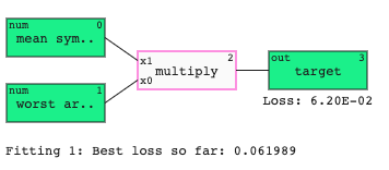
In this example, we'll use a simple classification that we on purpose can't fully fit with our chosen graph size, and filter our data to ask the question we want to know more about - the false positives.
We're not going to worry with fitting multiple times or updating the QLattice in this instance - we just fit once and select the best graph of a maximum depth of 1 - which will allow it to use at most two features as inputs.
import feyn
from sklearn.datasets import load_breast_cancer
import pandas as pd


breast_cancer = load_breast_cancer()
input_columns = breast_cancer.feature_names

# Load into a pandas dataframe
data = pd.DataFrame(breast_cancer.data, columns=input_columns)
data['target'] = pd.Series(breast_cancer.target)

train, test = feyn.tools.split(data, stratify='target')

# Fitting
ql = feyn.QLattice(random_seed=42)

models = ql.auto_run(
     train,
    'target',
    max_complexity=2,
    n_epochs=1
)

best = models[0]
best
After fitting the graph, we'll finally evaluate it on the test set, and dive deeper into the data points we'd like to know more about - simulating a situation in a real-life scenario where a running model produces a wrong prediction you'd like to be able to explain.
best.plot_confusion_matrix(test)

As we hoped, this graph was too restricted to fit the problem, and we have some false positives to inspect.
def filter_FP(prediction_series, truth_series, truth_df):
    pred = prediction_series > 0.5
    return truth_df.query('@truth_series != @pred and @truth_series == False')

predictions = best.predict(test)
false_positives = filter_FP(predictions, test.target, test)
false_positives
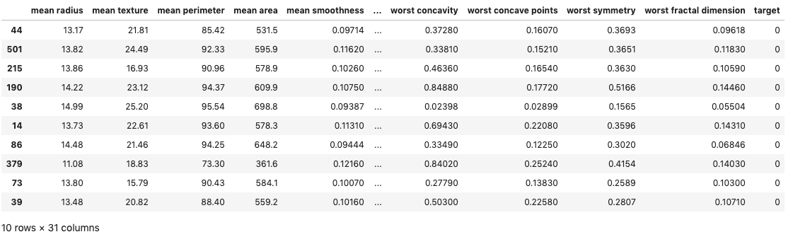
This gives us a list of all the samples in the test set that the model predicted to be True, but were supposed to be False.
Of course, all of this can also be done with a dictionary of numpy arrays if you prefer that over pandas - but the preparation code will have to be adjusted for working with that.
Importance Table
Now that we know what we want to know more about, it's simpler to use and understand the outputs of the tool. The following code calculates the SHAP value for our filtered data - the false positives - and uses the training set as reference for background data. When in doubt, you should always use the dataset your model was trained on for reference - since it describes its behaviour best.
For this case, we have very few features that the graph ended up using, and a large table. We can make this a bit more sensible by filtering by the graph features (but you don't have to):
from feyn.insights import FeatureImportanceTable

features = best.features
table = FeatureImportanceTable(best, false_positives[features], bg_data=train[features])
table
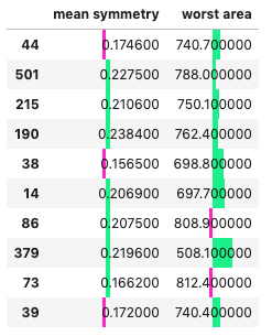
You'll notice from this table, that it renders each sample in a dataframe and plots a bar chart on each column. This shows the degree to which each feature contributed towards the negative (False) or positive direction (True) for the prediction. For a regression case, this would be the same, but centered around the base value (the mean prediction).
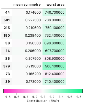
You can also choose to render it as a heatmap instead, if you prefer that to reading it as a chart.
You can do it by adjusting the styling property on the returned table object, or by passing it as an argument.
table.styling.style = 'fill'
table
is equivalent to:
table = FeatureImportanceTable(best, false_positives[features], bg_data=train[features], style='fill')
table
but saves recomputing the values.
What about normal SHAP visualizations?
You can use the internals of this function to input into your favourite SHAP plotting library, or you can even just use our SHAP implementation directly in feyn.insigths.KernelShap. We won't go into details on how to use this, as it's of similar nature to the process above, and all other SHAP implementations out there. You can check the API Reference for more info.
You can get the SHAP importance values from the internals of the table like this
importances = table.importance_values
array([[-0.00136194,  0.14264939],
       [ 0.00926901,  0.02617117],
       [ 0.01086387,  0.12908358],
       [ 0.0172759 ,  0.10280851],
       [-0.00977484,  0.21837655],
       [ 0.01167485,  0.23540937],
       [ 0.00294184, -0.03993147],
       [ 0.00752346,  0.37022395],
       [ 0.0003935 , -0.04824079],
       [-0.00235883,  0.14267193]])
And you can access the importances for the background data using
bg_importances = table.bg_importance
array([[ 2.91090801e-03,  3.64154272e-01],
       [-5.14067832e-03,  3.46074125e-01],
       [ 2.75646539e-03,  3.77098630e-01],
       (...)
       [ 1.10805174e-03, -6.12986538e-01],
       [ 6.66648740e-03,  9.49804651e-02],
       [-1.39316220e-02,  8.02177086e-02]])
Wrapping up
Hopefully, this was a helpful introduction on how you can use your existing skillset of SHAP with Feyn, and get some estimates on feature importances.