Airbnb prices
by: Chris Cave
Feyn version: 2.1+
Last updated: 23/09/2021
Here we use the QLattice to predict the rental price for Airbnb apartments in New York. The purpose of this tutorial is to show how to use auto_run in a regression problem.
import numpy as np
import pandas as pd

import feyn
Connect to QLattice
ql = feyn.connect_qlattice()
ql.reset(random_seed=42)
Read in a data set
The Airbnb dataset is known from Kaggle. It describes the rental price applied to actual rentals over several years in New York City
data = pd.read_csv('../data/airbnb.csv')
data=data.drop(["name","host_name", "last_review","id","host_id"], axis=1)
data=data[data["price"]<400].dropna()
data.head()
| neighbourhood_group | neighbourhood | latitude | longitude | room_type | price | minimum_nights | number_of_reviews | reviews_per_month | calculated_host_listings_count | availability_365 | |
|---|---|---|---|---|---|---|---|---|---|---|---|
| 0 | Brooklyn | Kensington | 40.64749 | -73.97237 | Private room | 149 | 1 | 9 | 0.21 | 6 | 365 |
| 1 | Manhattan | Midtown | 40.75362 | -73.98377 | Entire home/apt | 225 | 1 | 45 | 0.38 | 2 | 355 |
| 3 | Brooklyn | Clinton Hill | 40.68514 | -73.95976 | Entire home/apt | 89 | 1 | 270 | 4.64 | 1 | 194 |
| 4 | Manhattan | East Harlem | 40.79851 | -73.94399 | Entire home/apt | 80 | 10 | 9 | 0.10 | 1 | 0 |
| 5 | Manhattan | Murray Hill | 40.74767 | -73.97500 | Entire home/apt | 200 | 3 | 74 | 0.59 | 1 | 129 |
Split the data
train, test = feyn.tools.split(data, ratio=(3,1), random_state=42)
Declare semantic types
The following columns are categorical:
neighbourhood_groupneighbourhoodroom_type
We need to declared this in a dictionary that will then pass to the auto_run function
stypes = {
    'neighbourhood_group': 'c',
    'neighbourhood': 'c',
    'room_type': 'c'
}
Use auto_run to obtain fitted models
This function we use to run a simulation on a QLattice and return the 10 best and most diverse models to the data
models = ql.auto_run(
    train,
    output_name='price',
    stypes=stypes
    )
Summary plot
This return the metrics of the model on the train and test set.
best = models[0]
best.plot(train, test)
Training Metrics

Test

Trend
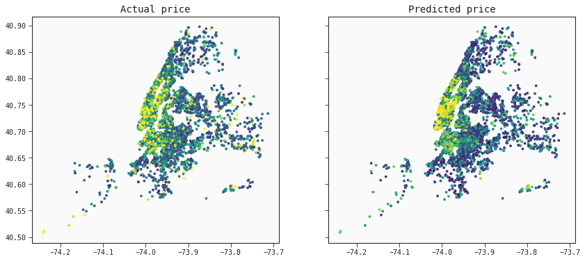
The model captures the trend of prices as we can see from this map of New York City.
pred_test = best.predict(test)
f, ax = plt.subplots(nrows=1, ncols=2, sharey=True, sharex=True, figsize=(14, 6))

# Default colors
ax[0].scatter(test["longitude"],test["latitude"], cmap="viridis", c=test['price'], vmax=200, s=8)
ax[0].set_title('Actual price')
ax[1].scatter(test["longitude"],test["latitude"], cmap="viridis", c=pred_test, vmax=200, s=8)
ax[1].set_title('Predicted price')

plt.show()