Plotting the loss graph
by: Kevin Broløs
Feyn version: 2.1+
Last updated: 13/10/2021
In this example, we'll explore a few different ways we can get a traditional loss graph during training with feyn and the QLattice.
Training using the primitives
auto_run is great, but we can actually accomplish exactly the same behaviour just using the primitives, and it allows us to inject this plot in the flow quite easily. You can read more about how auto_run can be decomposed here. I am going to assume you've read that and know how the standard fitting loop works.
In broad strokes, you:
- Sample models from the
QLattice, and add them to your collection of models - Fit all the models, which will rank them according to your criterion ('aic', 'bic' or None for loss)
- (Optional) Prune the worst performing models according to a decay function. This helps performance a lot by reducing the time spent fitting bad models.
- Update the
QLatticewith your ranked list of models
Repeat process until done.
Preparation
First, we'll go through a few steps to prepare ourselves for training
Loading dependencies and a dataset
import feyn
from sklearn.datasets import load_breast_cancer
import matplotlib.pyplot as plt
import numpy as np

data = load_breast_cancer(as_frame=True).frame
Let's define some useful variables about our problem type
# It's a classification problem, so let's use binary cross entropy
kind = 'classification'
loss_function = 'binary_cross_entropy'

# The output name in the dataframe is called 'target', as is standard for sklearn datasets.
output_name = 'target'

# How long to train, how many threads, ranking criterion
n_epochs = 20
threads = 4
criterion = 'bic'

# The all-important random_seed
random_seed = 42
Data validation and splitting
auto_run validates the data, so we might as well do the same.
We then split it in train and test. We will also split the train set again into a validation set, that we'll use later!
feyn.validate_data(data, kind, output_name)
train, test = feyn.tools.split(data, random_state=random_seed)
train, validation = feyn.tools.split(train, random_state=random_seed)
And connect to our QLattice
ql = feyn.connect_qlattice()
A simple approach
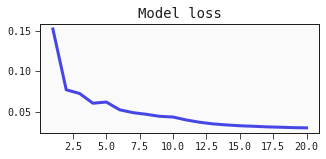
Defining a helper function for plotting the loss
We define a simple function we can call using matplotlib, that will display our loss values over time
def plot_losses(loss_values, epoch, n_epochs):
    x0 = list(range(1, epoch+1))
    plt.figure(figsize=(5, 2))
    plt.plot(x0, loss_values)
    plt.title('Model loss')
    plt.show()
Training loop
This is the standard fitting loop, with the addition of recording the best loss at every epoch and plotting it.
I've inserted comments in the places where something special is happening:
ql.reset(random_seed)

# Keeping track of the loss values over time
train_losses = []

models = []
for epoch in range(1, n_epochs+1):
    models += ql.sample_models(train, output_name, kind)

    models = feyn.fit_models(models, train, threads=threads, loss_function=loss_function, criterion=criterion)
    models = feyn.prune_models(models)

    # Append the latest loss value of the top model and display the loss with our function
    train_losses.append(models[0].loss_value)
    plot_losses(train_losses, epoch, n_epochs)

    # Note: because we use IPython.display (update_display=True) in show_model, the order here is important.

    feyn.show_model(
        models[0],
        # Just a simple label. Auto_run is more sophisticated.
        label=f"Epoch {epoch}/{n_epochs}.",
        update_display=True,
    )

    ql.update(models)

models = feyn.get_diverse_models(models)

# Display the final model and the loss graph
plot_losses(train_losses, epoch, n_epochs)
models[0].show(update_display=True)
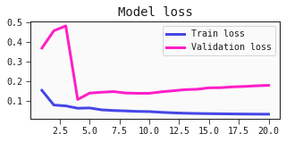
Adding the validation loss
Maybe you would like to instead plot the training loss against the validation loss?
It should be easy to modify the code above to plot both. One caveat is that we need to know what loss is being used by the trainer.
We're using binary cross entropy, since it's a classification task.
Below, we have a modified plot_losses function, as well as an adjusted training loop to now also compute and keep track of the validation losses.
def plot_losses(train_losses, val_losses, epoch, n_epochs):
    x0 = list(range(1, epoch+1))
    plt.figure(figsize=(5, 2))
    plt.plot(x0, train_losses, label='Train loss')
    plt.plot(x0, val_losses, label='Validation loss')
    plt.title('Model loss')
    plt.legend()
    plt.show()
from feyn.losses import binary_cross_entropy

ql.reset(random_seed)

# Keeping track of the loss values over time
train_losses = []
val_losses = []

models = []
for epoch in range(1, n_epochs+1):
    models += ql.sample_models(train, output_name, kind)

    models = feyn.fit_models(models, train, threads=threads, loss_function=loss_function, criterion=criterion)
    models = feyn.prune_models(models)

    train_losses.append(models[0].loss_value)

    # Calculate the mean binary cross entropy of the validation dataset
    val_loss = np.mean(binary_cross_entropy(validation[output_name], models[0].predict(validation)))
    val_losses.append(val_loss)

    # Plot both!
    plot_losses(train_losses, val_losses, epoch, n_epochs)

    feyn.show_model(
        models[0],
        label=f"Epoch {epoch}/{n_epochs}.",
        update_display=True,
    )

    ql.update(models)

models = feyn.get_diverse_models(models)

# Display the final model and the loss graph
plot_losses(train_losses, val_losses, epoch, n_epochs)
models[0].show(update_display=True)
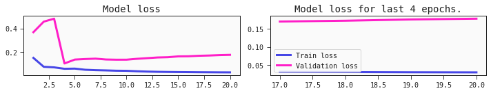
A zoomed graph
When training models with feyn, you'll notice that the improvements tends to go in "jumps" as it finds more useful models. This is because we're learning the structure of the model, not just fitting them. As we find the next best structure, it may jump significantly.
To counteract this scaling making the plot harder to read, you can make a function to give atotal view of the loss development as well as a window of the last few epochs.
The lookbehind for the window here is not set in stone, and you can define it to your own liking. This one will either start it when the epochs are more than a fifth of the total epochs, or 50 epochs have passed - whichever comes first. I find that a window of more than 50 epochs is not super useful in long training runs.
def plot_losses(loss_values, val_losses, epoch, n_epochs):
    lookbehind = min(max(int(n_epochs / 5), 1), 50)

    x0 = list(range(1, epoch+1))
    if epoch <= lookbehind:
        # This is the same code as before
        plt.figure(figsize=(5, 2))
        plt.plot(x0, loss_values, label="Train loss")
        plt.plot(x0, val_losses, label="Validation loss")
        plt.title('Model loss')
    else:
        # This uses subplots to also plot a window of the n most recent epochs
        _, axs = plt.subplots(1, 2, figsize=(10, 2))
        lb_len = len(loss_values[-lookbehind:])

        axs[0].plot(x0, loss_values, label="Train loss")
        axs[0].plot(x0, val_losses, label="Validation loss")
        axs[0].set_title('Model loss')


        x1 = list(range(max(epoch-lb_len,1), epoch+1)[-lookbehind:])
        axs[1].plot(x1, loss_values[-lookbehind:], label="Train loss")
        axs[1].plot(x1, val_losses[-lookbehind:], label="Validation loss")
        axs[1].set_title(f'Model loss for last {lookbehind} epochs.')

    plt.tight_layout()
    plt.legend()
    plt.show()
Training again
This code is exactly the same as our previous case - the only change is in the plotting function above.
from feyn.losses import binary_cross_entropy

ql.reset(random_seed)

# Keeping track of the loss values over time
train_losses = []
val_losses = []

models = []
for epoch in range(1, n_epochs+1):
    models += ql.sample_models(train, output_name, kind)

    models = feyn.fit_models(models, train, threads=threads, loss_function=loss_function, criterion=criterion)
    models = feyn.prune_models(models)

    train_losses.append(models[0].loss_value)

    # Calculate the mean binary cross entropy of the validation dataset
    val_loss = np.mean(binary_cross_entropy(validation[output_name], models[0].predict(validation)))
    val_losses.append(val_loss)

    # Plot both!
    plot_losses(train_losses, val_losses, epoch, n_epochs)

    feyn.show_model(
        models[0],
        label=f"Epoch {epoch}/{n_epochs}.",
        update_display=True,
    )

    ql.update(models)

models = feyn.get_diverse_models(models)

# Display the final model and the loss graph
plot_losses(train_losses, val_losses, epoch, n_epochs)
models[0].show(update_display=True)
Evaluation and next steps
How you decide to use this is up to you. Now that you have access to this information, maybe a natural next step is to use the validation loss to do model selection.
Normally, you would also evaluate the model on the test (or holdout) set, but we'll save that for now.
Hopefully this gives you some inspiration for what you can achieve with the decomposed workflow!