Predicting with a model
by: Kevin Broløs & Chris Cave
(Feyn version 3.4.0 or newer)
A Model that has been fitted can be used to perform predictions on a dataset.
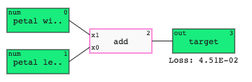
An example model that adds two inputs together could look like this:
A regressor outputs values within the range of the output variable.
A binary classifier outputs values between 0 and 1. These are the probabilities of the samples belonging to the positive class. This can be rounded to get a discrete prediction of 0 or 1.
Requirements
The data you want to predict for should:
- be a
pandas.DataFrameorpandas.Series; - contain the inputs present in the
Model.
Any additional columns in the DataFrame that are not inputs to the model will be automatically ignored, so you don't have to filter the dataset beforehand.
Example
Here is an example of using the predict function.
import feyn
from feyn.datasets import make_classification

# Generate a dataset and put it into a dataframe
train, test = make_classification()

# Instantiate a QLattice and run a classification simulation
ql = feyn.QLattice()
models = ql.auto_run(
    data=train,
    output_name='y'
)

# Select the best model and predict
best = models[0]

# Predicting on a DataFrame
best.predict(test)

# Predicting on a Series
best.predict(test.iloc[0])
The predict function returns a np.array of predictions.
Further exploration
For guides on how to evaluate a model, check out regression plot for regressors and ROC curve for classifiers.