Segmented loss
by: Kevin Broløs, Valdemar Stentoft-Hansen and Chris Cave
(Feyn version 3.0 or newer)
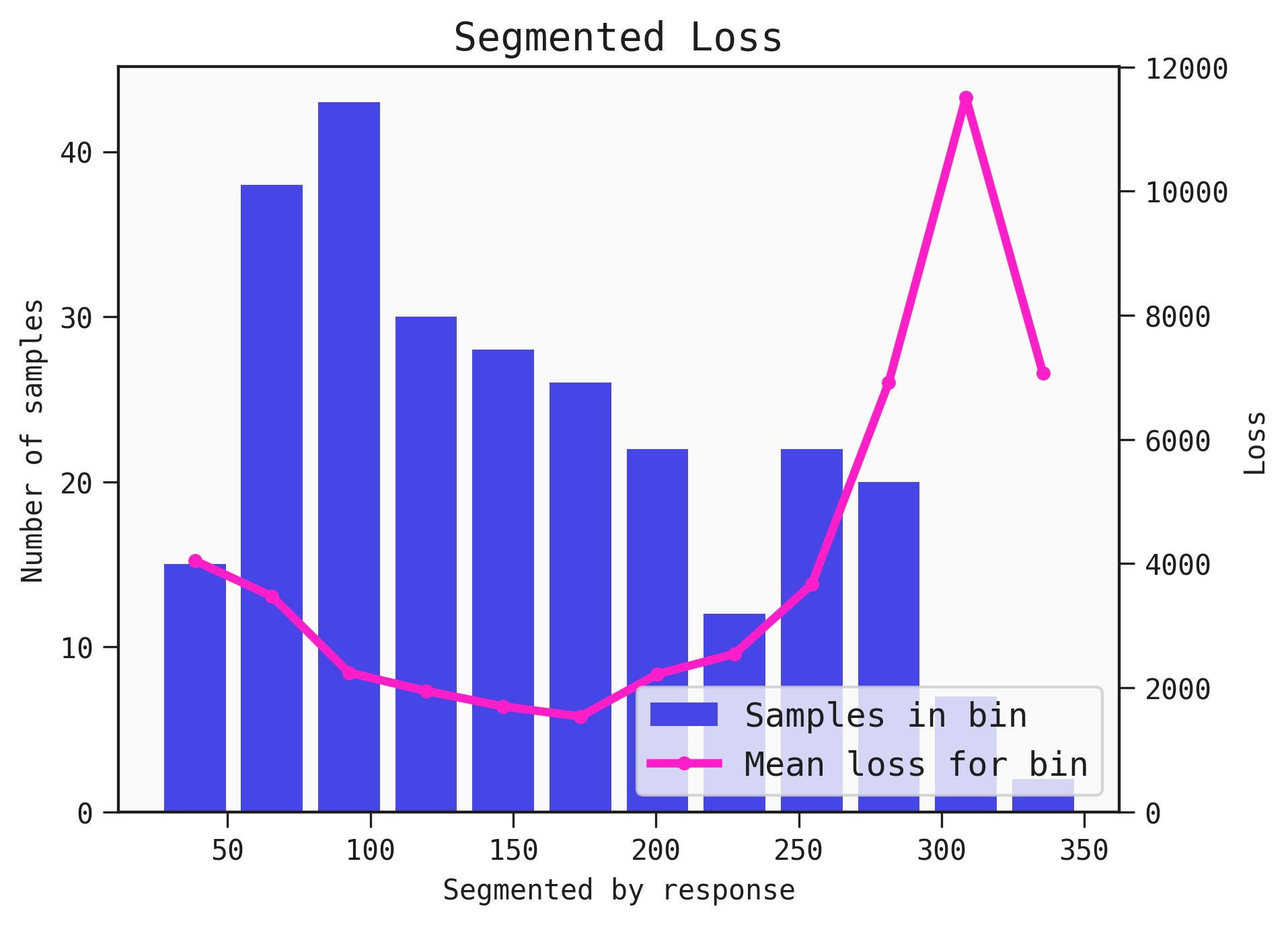
A Models performance varies across a dataset. The plot_segmented_loss displays the distribution of an input or output as a histogram and is overlayed with the average loss for the associated bin.
Example
You can use the plot_segmented_loss function to determine areas where the Model performs best and worst across the inputs and output.
import feyn

from sklearn.datasets import load_diabetes
import pandas as pd

from feyn.tools import split

# Load diabetes dataset into a pandas dataframe
dataset = load_diabetes()
df_diabetes = pd.DataFrame(dataset.data, columns=dataset.feature_names)
df_diabetes['response'] = dataset.target

# Train/test split
train, test = split(df_diabetes, ratio=[0.6, 0.4])

# Instantiate a QLattice
ql = feyn.QLattice()

models = ql.auto_run(
    data=train,
    output_name='response'
)
# Select the best Model
best = models[0]

best.plot_segmented_loss(
    data = train,
    by = None
)
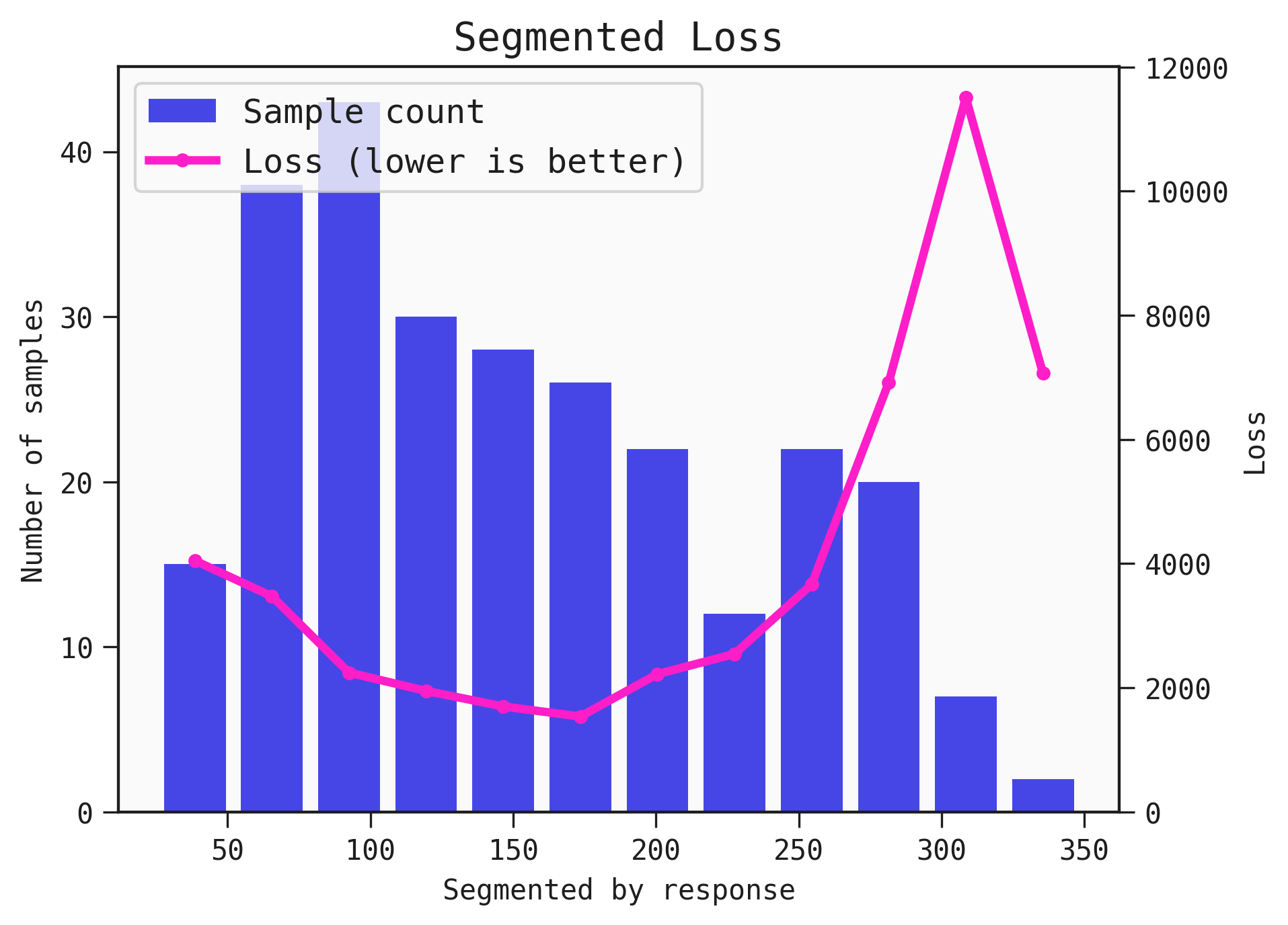
Customising the plot labels
You can customise the labels of the series in the plot with your own labels, by supplying them to the legend parameter. You can also adjust the positioning of the legend.
The legend array goes in the order: histogram, line.
best.plot_segmented_loss(
    data = train,
    by = None,
    legend=["Sample count", "Loss (lower is better)"],
    legend_loc="upper left")
Saving the plot
You can save the plot using the filename parameter. The plot is saved in the current working directory unless another path specifed.
best.plot_segmented_loss(train, filename="feyn-plot")
Parameters of plot_segmented_loss
data
The data passed in this parameter is used to determine the bins of the input or output the plot is segemented by and the average loss across the bin.
by
The input name or output to segment the loss over.
Location in Feyn
This function can also be found in feyn.plots module.
from feyn.plots import plot_segmented_loss

plot_segmented_loss(best, train)