ROC curve
by: Chris Cave
(Feyn version 3.4.0 or newer)
There are many different metrics to evaluate a classification model: accuracy, precision, recall, F1 score etc. Each of these metrics require fixing a decision boundary. Above this boundary, the sample will be classified as True (positive) and below the sample will be classified as False (negative). Typically this boundary is called a threshold and is set at 0.5.
However, you can imagine situations where you, as an example, want a classifier that does not predict a positive class unless it is very sure in order to reduce the False Positive Rate.
Here you could increase the threshold from 0.5 to something much higher say 0.8.
In this case, the classifier would only predict positives when it was nearly certain, reducing the amount of negatives that are classified wrongly (False Positives). However, this may come at the cost of the classifier missing more of the actual positives (increasing False Negatives and thus reducing the True Positive Rate).
The receiver operating characteristic (ROC) captures how the classifier behaves at different thresholds. This gives a good indication where to make the best trade offs, and plotting it as a curve gives you a good visual representation of the classifier's performance.
This plot only works for classifiers, and will return a type error if you try to use it on a regressor.
Example
We first load a classification data set and train a classifier.
import feyn
import pandas as pd
from sklearn.datasets import load_breast_cancer


# Load into a pandas dataframe
breast_cancer = load_breast_cancer(as_frame=True)
data = breast_cancer.frame

# Train/test split
train, test = feyn.tools.split(data, ratio=[0.6, 0.4], stratify='target', random_state=666)

ql = feyn.QLattice()
models = ql.auto_run(
    data=train,
    output_name = 'target'
)

best = models[0]
Plotting the ROC curve
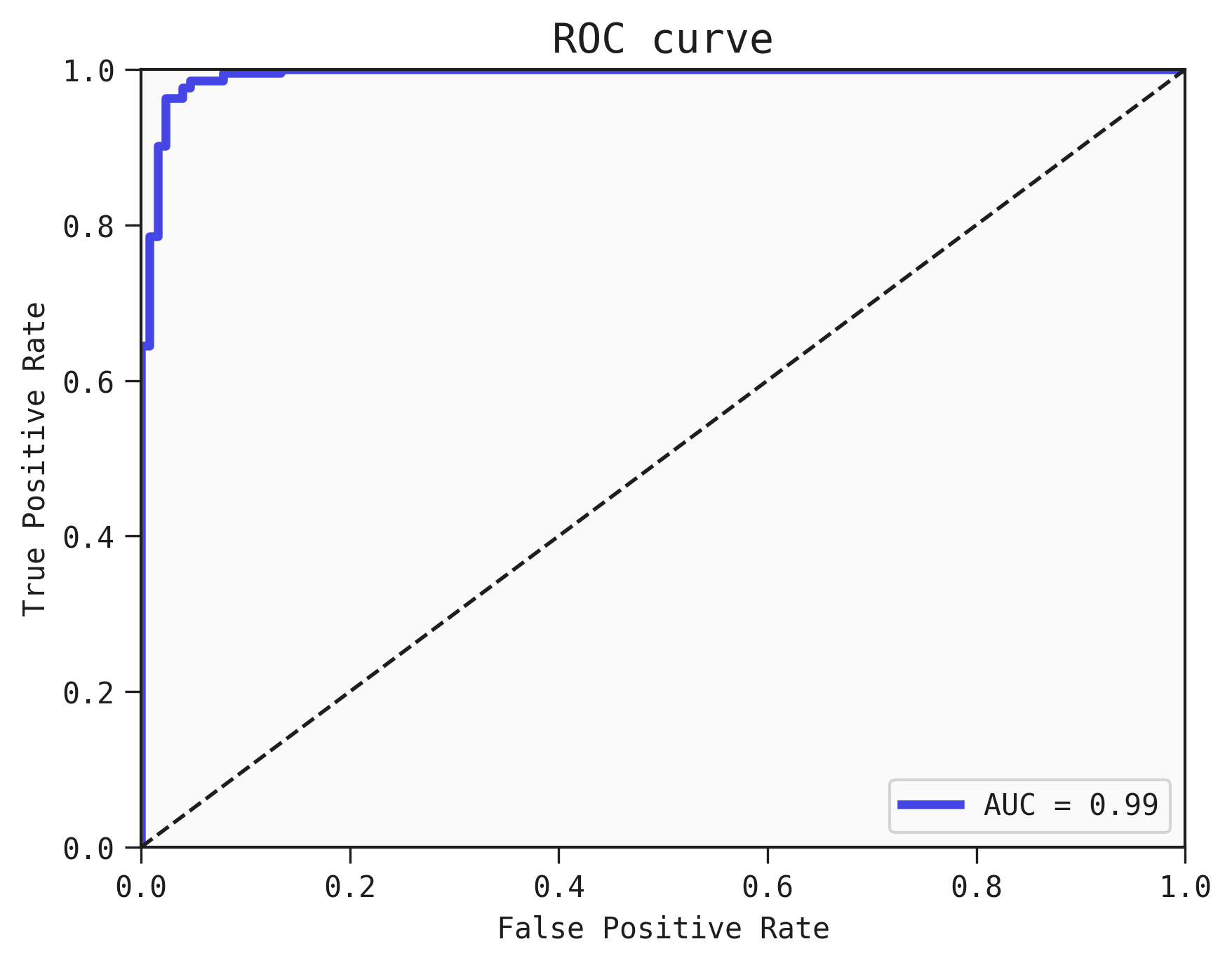
We use plot_roc_curve to plot a curve over the different False Positive Rates and True Positive Rates of the classifier at different thresholds.
To get an overall view of the model's performance, the AUC is a useful score that can be computed by integrating the Area Under the Curve of the ROC. Generally speaking higher is better, as a perfect classifier should be equal to 1.0.
We also show the AUC in the ROC curve
best.plot_roc_curve(train)
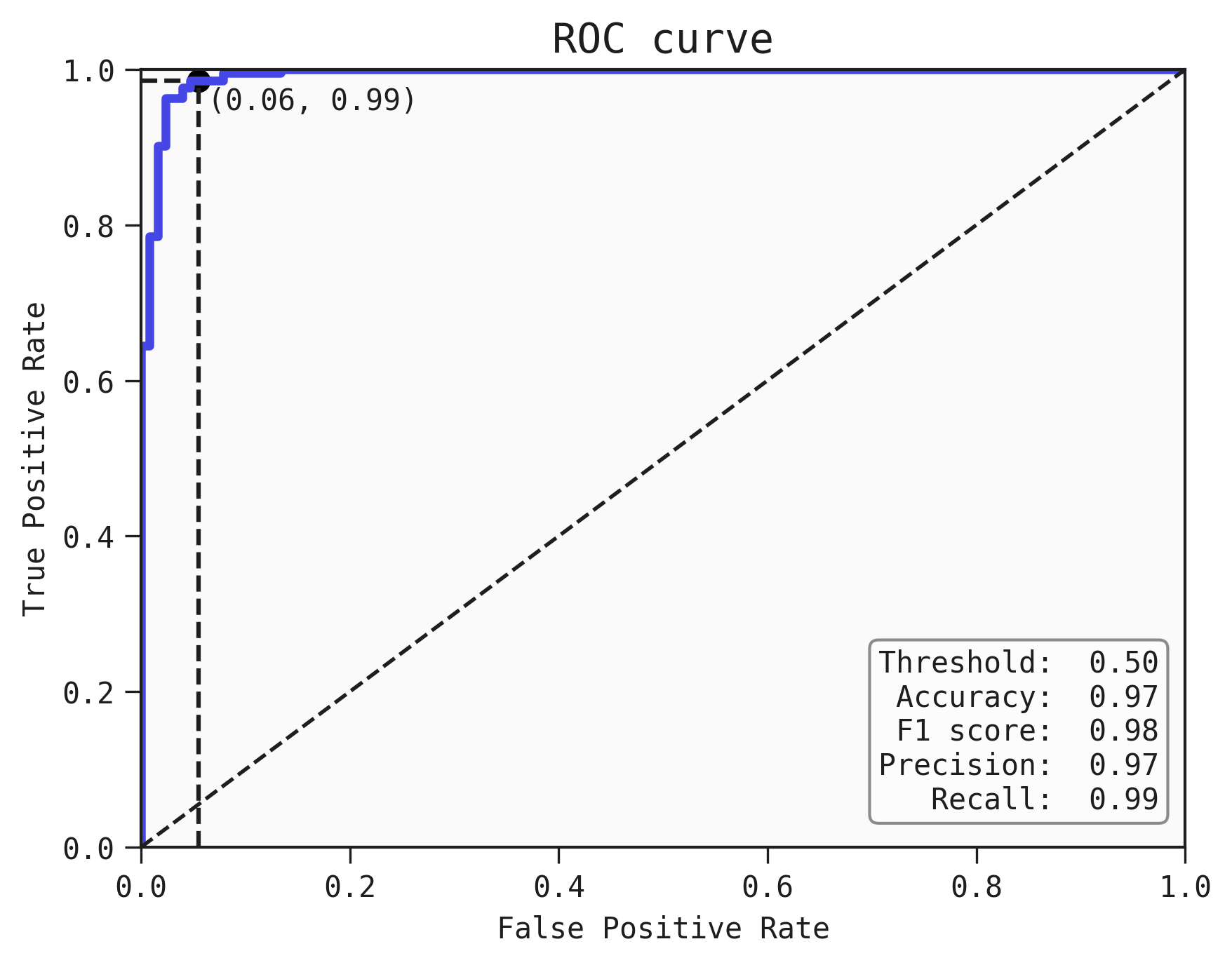
Adding a threshold to the ROC curve
We can plot a particular threshold on the curve and find out the metrics of the classifier (accurarcy, F1 score, Precision and recall) at this threshold
best.plot_roc_curve(train, threshold=0.5)
Precision-Recall curve
In some cases, you may want to plot the curve for the Precision-Recall tradeoff as well. You can do that using the plot_pr_curve function, like this:
best.plot_pr_curve(train)
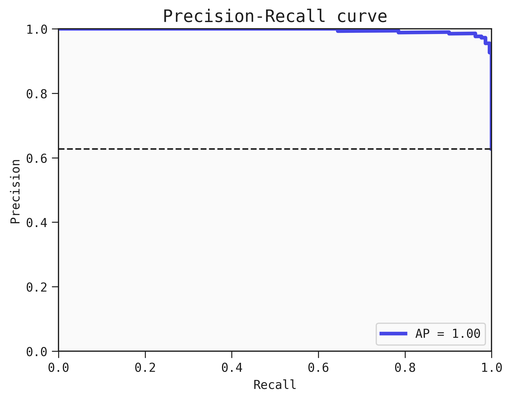
Where AP refers to the average precision.
Saving the plot
You can save the plot using the filename parameter. The plot is saved in the current working directory unless another path specifed.
best.plot_roc_curve(data=train, filename="feyn-plot")
If the extension is not specified then it is saved as a png file.
Location in Feyn
This function can also be found in feyn.plots module.
from feyn.plots import plot_roc_curve

y_true = train['target']
y_pred = best.predict(train)

plot_roc_curve(y_true, y_pred)