Residuals plot
by: Kevin Broløs & Chris Cave
(Feyn version 3.0 or newer)
Aside from the training metrics, Feyn offers a range of tools to help you evaluate your Model.
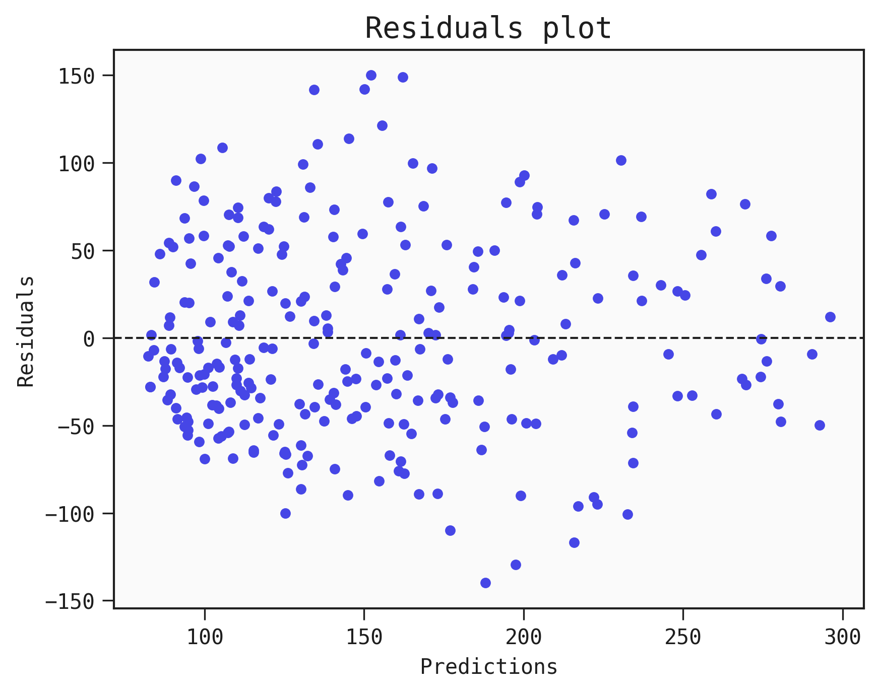
One of the basic diagnostics we can do with a regression Model is to plot the residuals (y_true - y_pred, the difference between the prediction and the truth).
This can help analyse whether errors are normally distributed or not. If they have an unusual distribution then it points towards biases in the Model. If they appear to be randomly scattered then this is a positive sign that the Model is unbiased.
Example
As sample data we are going for the Diabetes dataset made available by scikit-learn.
Below we import data, prepare it and find a good Model from a QLattice:
import feyn

from sklearn.datasets import load_diabetes
import pandas as pd

from feyn.tools import split

# Load diabetes dataset into a pandas dataframe
dataset = load_diabetes()
df_diabetes = pd.DataFrame(dataset.data, columns=dataset.feature_names)
df_diabetes['response'] = dataset.target

# Train/test split
train, test = split(df_diabetes, ratio=[0.6, 0.4])

# Instantiate a QLattice
ql = feyn.QLattice()

models = ql.auto_run(
    data=train,
    output_name='response'
)
# Select the best Model
best = models[0]
Plotting the residuals
best.plot_residuals(data=train)
Saving the plot
You can save the plot using the filename parameter. The plot is saved in the current working directory unless another path specifed.
best.plot_residuals(data=train, filename="feyn-plot")
If the extension is not specified then it is saved as a png file.
Location in Feyn
This function can also be found in feyn.plots module.
from feyn.plots import plot_residuals

y_true = train['response']
y_pred = best.predict(train)

plot_residuals(y_true, y_pred)