Interactive flow
by: Kevin Broløs and Chris Cave
(Feyn version 3.1.0 or newer)
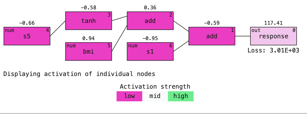
The output value of a node within a neural network of a given data point is called the activation value. Usually neural networks are dense with many nodes so it can be difficult to decipher what a particular activation value at a given node can mean in the overall picture of the model. The Models from the QLattice are much less dense than a neural network which means that the activation values are much easier to decode.
This gives the benefit that one can interpret how each activation value affects the output and thus how each feature contributes to the model. This is what the method plot_flow and plot_flow_interactive captures.
Example
import feyn

from sklearn.datasets import load_diabetes
import pandas as pd

from feyn.tools import split

# Load into a pandas dataframe
dataset = load_diabetes()
df_diabetes = pd.DataFrame(dataset.data, columns=dataset.feature_names)
df_diabetes['response'] = dataset.target

# Train/test split
train, test = split(df_diabetes)

# Instantiate a QLattice
ql = feyn.QLattice()

models = ql.auto_run(
    data=train,
    output_name='response'
)
# Select the best Model
best = models[0]

best.plot_flow(
    data=train,
    sample=train.iloc[0:1]
)

The method plot_flow takes a single sample and plots the activation values at each node. It displays these value above each node.
Interactive mode
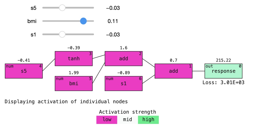
The experimental method interactive_activation_flow uses plot_flow and make this interactive as in the image below.
from feyn.plots.interactive import interactive_activation_flow

interactive_activation_flow(best, train)

As with all models one should be very careful when they investigate how the Model behaves outside the domain it has been trained on. This could given unusual and unexpected results which would need further investigation.
This tool is only for IPython kernels. This requires installing ipywidgets and enabling the extension in jupyter notebook:
$ jupyter nbextension enable --py widgetsnbextension
or in jupyter lab:
$ jupyter labextension install @jupyter-widgets/jupyterlab-manager
Parameters of plot_flow
data
This should be the data the model has trained on.
sample
The single sample you want to visualize.
filename
Use to specify a path to a file to save the plot to (as SVG).
best.plot_flow(
    data=train,
    sample=train.iloc[0:1],
    filename='flow.svg'
)
Note that the interactive version does not support saving to file - you can instead use the non-interactive version for this purpose. It also does not take the sample as a parameter.
Location in Feyn
This function can also be found in feyn.plots module.
from feyn.plots import plot_activation_flow

plot_activation_flow(best, train, train.iloc[0:1])
