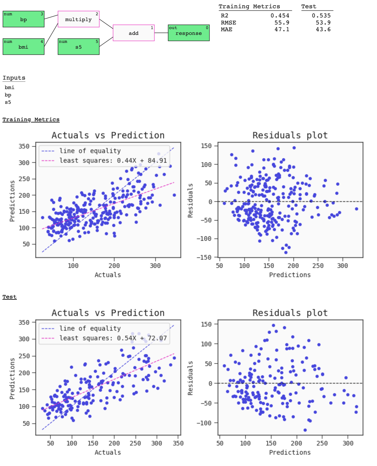
Summary plot
by: Kevin Broløs & Chris Cave
(Feyn version 3.0 or newer)
The summary of a Model can be seen using the plot function on the Model. This provides a graph visualisation of the Model with metrics and useful plots. The metrics and plots of the Model on the data passed are:
- For regressors:
- R2 score,
- Root mean squared error,
- Mean absolute error,
- Regression plot,
- Residuals plot.
- For classifiers:
- Accuracy at 0.5 threshold,
- AUC,
- Precision at 0.5 threshold,
- Recall at 0.5 threshold,
- ROC curve,
- Confusion matrix at 0.5 threshold.
Example
import feyn

from sklearn.datasets import load_diabetes
import pandas as pd

from feyn.tools import split

# Load diabetes dataset into a pandas dataframe
dataset = load_diabetes()
df_diabetes = pd.DataFrame(dataset.data, columns=dataset.feature_names)
df_diabetes['response'] = dataset.target

# Train/test split
train, test = split(df_diabetes, ratio=[0.6, 0.4], random_state=42)

# Instantiate a QLattice
ql = feyn.QLattice(random_seed=42)

models = ql.auto_run(
    data=train,
    output_name='response'
)
# Select the best Model
best = models[0]
best.plot(
    data=train,
    compare_data=test
)

Parameters for model.plot
data
This should be the data the model has trained on.
compare_data
Can take a single dataframe to compare with, or a list of dataframes - in case you want to compare multiple datasets or splits with each other.
labels
You can pass in custom labels for the header of the summary metrics. If your list of labels is shorter than the compare_data argument, numbered labels will be generated for the rest.
filename
Use to specify a path to a file to save the plot to (as HTML).
best.plot(train, filename="feyn-summary.html")
Location in Feyn
This function can also be found in feyn.plots module.
from feyn.plots import plot_model_summary

plot_model_summary(best, train)
