Regression plot
by: Kevin Broløs & Chris Cave
(Feyn version 3.0 or newer)
Aside from the training metrics, Feyn offers a range of tools to help you evaluate your Model.
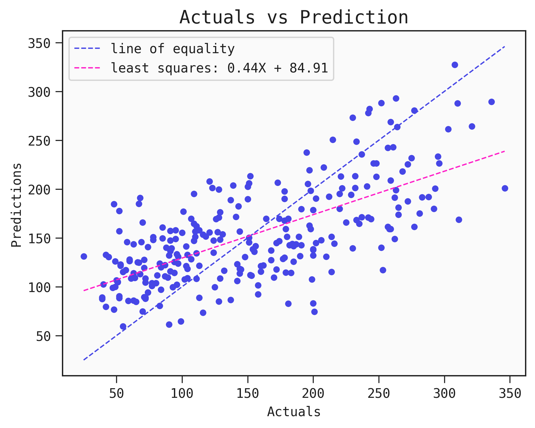
For a regression Model, you have the option to plot the predicted values against the actual values to better evaluate your Model.
Below, we use plot_regression to compare the true values of the target variable to the predicted values from the regressor.
Example
As sample data we are going for the Diabetes dataset made available by scikit-learn.
Below we import data, prepare it and find a good Model from a QLattice:
import feyn

from sklearn.datasets import load_diabetes
import pandas as pd

from feyn.tools import split

# Load diabetes dataset into a pandas dataframe
dataset = load_diabetes()
df_diabetes = pd.DataFrame(dataset.data, columns=dataset.feature_names)
df_diabetes['response'] = dataset.target

# Train/test split
train, test = split(df_diabetes, ratio=[0.6, 0.4], random_state=42)

# Instantiate a QLattice
ql = feyn.QLattice(random_seed=42)

models = ql.auto_run(
    data=train,
    output_name='response'
)
# Select the best Model
best = models[0]
Plotting the model predictions
We use plot_regression to plot the actual values (x-axis, labelled Actuals) to the predicted values (y-axis, labelled Predictions) from the regressor.
best.plot_regression(data=train)
If the prediction is perfect, then all the points should lie on the y=x dashed line. We can use this to see whether we overestimate or underestimate certain regions.
The line of equality is an aid to see just how close the points are to the truth.
Saving the plot
You can save the plot using the filename parameter. The plot is saved in the current working directory unless another path specifed.
best.plot_regression(data=train, filename="feyn-plot")
If the extension is not specified then it is saved as a png file.
Location in Feyn
This function can also be found in feyn.plots module.
from feyn.plots import plot_regression

y_true = train['response']
y_pred = best.predict(train)

plot_regression(y_true, y_pred)